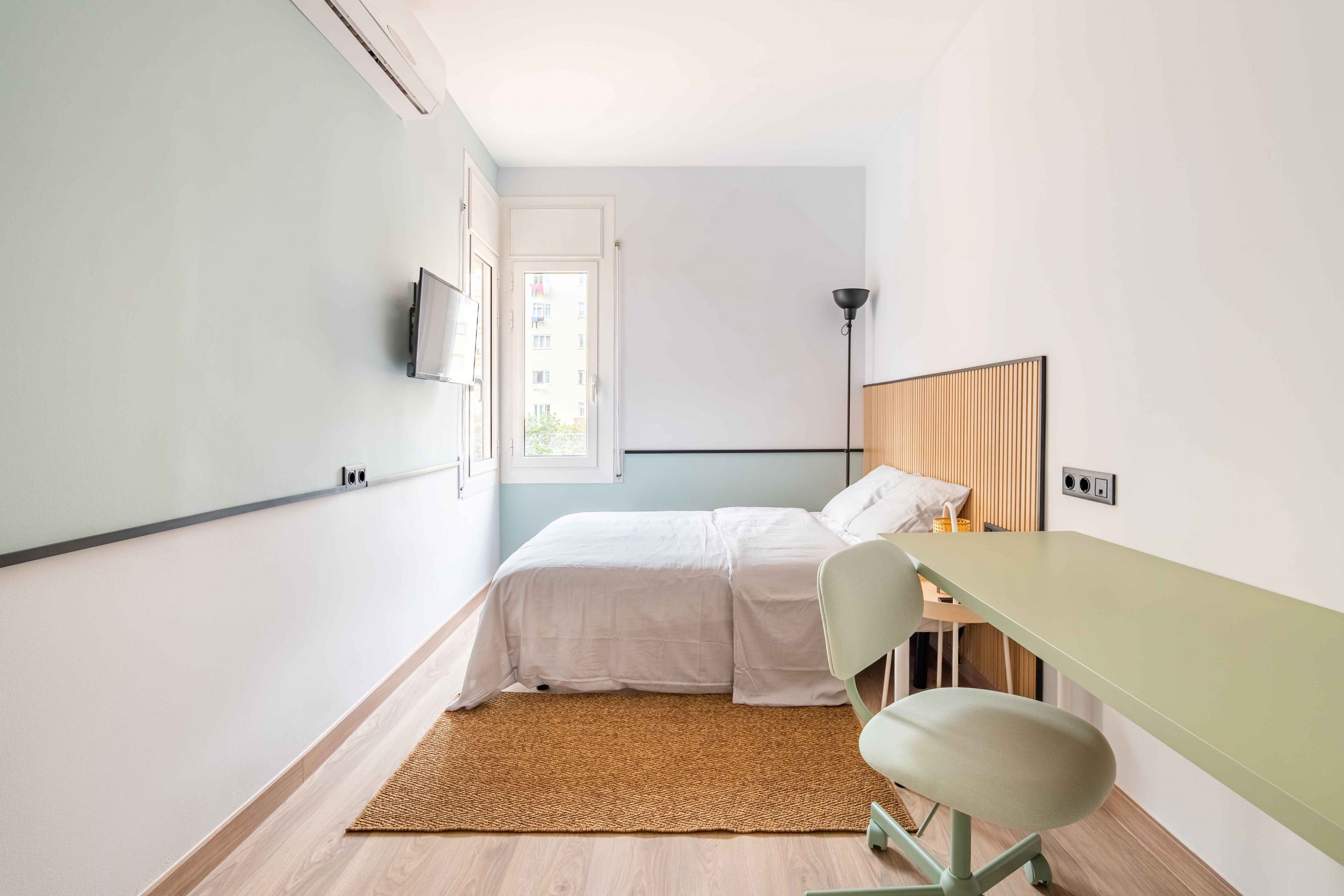
In the series How to Live With a Room You Hate, we ask design pros to solve everyday interior problems. Today, we tackle narrow rooms.
ODDLY DIMENSIONED ROOMS can be both harder to decorate and generally unwelcoming, said Joe McGuier: “We size up a room very quickly and our bodies respond. If it’s not the right scale, we feel uncomfortable.” The principal at JAM, a Brooklyn architecture and interiors studio said his team often deals with the challenges of narrow rooms. “We are rarely blessed with the right size room.”
Here, he and other interiors experts map out their strategies for dealing with a room that’s problematically longer than it is wide.
1. Zone Out
For rooms that seem to stretch on and on, experts suggest creating distinct areas so the space becomes a “journey.” Designers Anna Raventós and Lea Viscasillas, partners at Scala Studio, visually divided a long rectangular bedroom in a Barcelona apartment into two squares. The railroad-style room now invites their client to walk through a comfortably proportioned dressing room area before stepping up onto an airy sleeping stage. “We designed the room in two heights for a greater feeling of spaciousness,” said Raventós. Each zone has acquired its own personality. Oak millwork and a wall of wicker closet doors warm up the dressing area, while the bed sits in an all-white zone (even the floor is milky) that telegraphs a serene Mediterranean coolness. A wide storage bench straddles the juncture of the two spaces, creating a room divider without blocking light, and a grid of painted ceiling beams spans the entire room, unifying its two parts.
2. Stretch the Truth
In rooms too narrow to accommodate zones, McGuier chooses furniture that doesn’t needlessly sprawl, often turning to tidy, vintage mid-20th-century pieces. “In general, they are lower to the ground and more compact without sacrificing comfort,” said McGuier. He also preserves what little width the room offers by skipping heavy window treatments that might balloon out, choosing roller blinds instead. And he installs flush-face baseboards painted to match walls—letting them “disappear.”
3. Preserve the View
See-through coffee tables and cabinet doors can make a room feel wider. “Glass does not take up too much visual space,” said McGuier. In cramped quarters, he also favors airy end tables and chairs with visible legs to reveal as much floor as possible. “Look for a good mix so you don’t have a sea of legs,” he said. Andrea Benedettini, an interior designer in London, opens up a pent-up space with low-level lighting, placing table lamps in corners. “This makes a narrow room more inviting and less like a corridor.”
4. Get Ready for Your Close-up
“When a room is narrow, you’re interacting with everything,” said Benedettini, so choice of materials really matters. He used interesting textures to distract from a London living room’s lankiness. All quietly vying for attention are a cushy sculpted carpet; a tweedy wool wallcovering; fluffy brush fringes on the sofa pillows; and the surprising glimpse of herringbone upholstery that backs two armchairs. Even the bronze frames on the media unit’s glass help divert attention. “These details are really nicely curated so your focus is on these things and not the architecture,” he said. The curves of two barrel armchairs and a drum-shaped chandelier counter the insistent angularity of the room.
5. Be Accommodating, Underfoot
“The rug needs to be as big as possible so that all the furniture sits on it,” said Benedettini. A smaller rug with furniture spilling off it can make a room feel like it’s bursting at the seams. And because narrow rooms run the risk of feeling frenzied, Benedettini also opted for a single, calming seat cushion on the long, deep sofa he installed. Further quieting the room: Extra seating in the form of upholstered ottoman cubes is tucked neatly under the coffee table, pulled out when needed.


